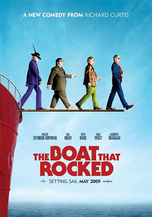
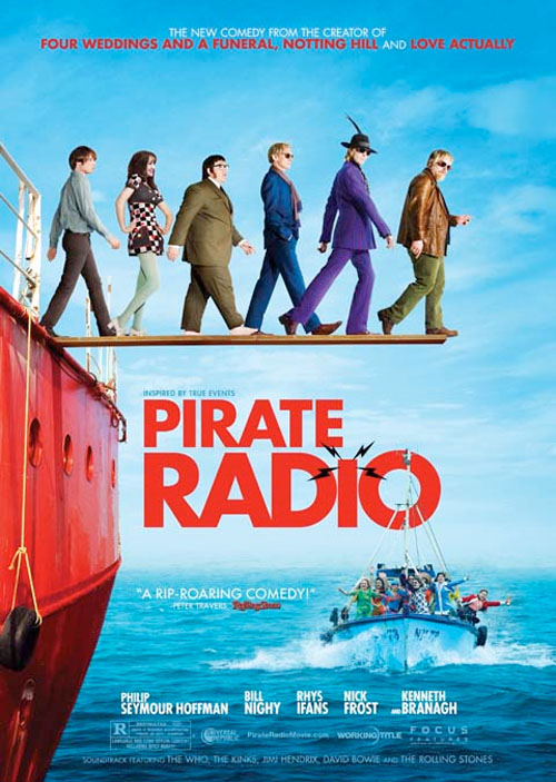
Exhibit A: the poster for Pirate Radio.
First, consider the original poster for The Boat That Rocked, when it was released in Britain with its original (superior) title.

This is a pretty clever poster. Obviously, it’s a reference to the cover of the Beatles’ Abbey Road, but smartly combined with the walking-off-a-plank motif which both suggests the pirate nature of the radio station as well as a hint to how things are going to end (it is not a spoiler to say that, yes, eventually the British government did manage to get the pirate stations shut down). It’s simple. It doesn’t try to do too much, and as a result it’s still a bit enigmatic without being obscure.
But apparently that wasn’t enough!

Now, this isn’t, one supposes, a bad poster. Certainly there are worse. But come on: this is lame. You completely lose the Abbey Road reference by shuffling around the order of the four principal actors and then adding the young but mostly unimportant male viewpoint character and the female character who is in the movie for maybe seven minutes tops (because young audiences don’t care about boring old Bill Nighy and Philip Seymour Hoffman!). Hoffman and Rhys Ifans have their heads cocked towards the camera acknowledging the viewer for absolutely no reason. And just in case you didn’t see the trailer and in case the young pretty fellow and the pair of tits did not convince you that these are actually for reals cool people, I guess we’d better add a boat full of screaming fans! That way you, as the viewer, know that Philip Seymour Hoffman is playing somebody cool for once, rather than boring old Lester Bangs who listens to records at three in the morning, or a possibly-gay priest who feuds with Meryl Streep.
AND IT’S THE SIXTIES Y’ALL SO LET’S MENTION THE SOUNDTRACK!
Honestly. Sometimes I am amazed that Hollywood actually ever manages to make a great poster anymore.
EDIT TO ADD: I think what really turns me off about the second poster is its rank desperation. ‘Look at me,” it says, “I got pretty young people, just like you like! They’re even English! I tried to get Robert Pattinson, I know how you like Robert Pattinson, but he wasn’t available. And don’t you like this boat? Full of screaming teenagers! You like that, right? Whyyyyyy don’t you liiiiiiike meeee?“


Related Articles
23 users responded in this post
I think it’s funny that the UK version gives Richard Curtis’ name, while the American one just lists his credits.
@rwe1138 : Well, lets be honest..most Americans aren’t going to know his name…wheras those of us who do think he’s a household name in England.
What I want to know is why did they change the boat they were walking off.
Target audience of first poster: people who appreciate aesthetics, Brits who know who these actors and the director are, people who remember when music came on records with album covers. Target audience of second poster: Americans.
What I want to know is why did they change the boat they were walking off.
To be fair, the second boat is more evocative of a boat (in terms of shape and location of the plank relative to the boat.) The second plank also looks a bit better, since it has actual 3-D perspective.
(Although probably the reason the Hollywood people changed the boat was to provide more room on the plank, so they could fit in the unnecessary extra 2 people.)
(Since I’m discussing minor changes, the second ocean+clouds is clearly worse, since the clouds+ocean should be drab to help elicit the mood of the ending.)
Need I remind you that nearly 49% of this country saw absolutely no problem with voting Sarah Palin into the second highest office in the land.
The USA is a culture that not only lacks refinement, but prefers it that way. Its almost as if we go out of our way to avoid the refinement.
“We’re not Spartans. We’re Americans, with a capital ‘A’, huh? You know what that means? Do ya? That means that our forefathers were kicked out of every decent country in the world. We are the wretched refuse. We’re the underdog. We’re mutts!” — Stripes
So when an intelligent, yet dry comedy/history piece comes out, the only way Hollywood can think to promote it is to sell it as a zany, screwball comedy.
“And, finally, here are some completely gratuitous pictures of penises to annoy the censors and to hopefully spark some sort of controversy, which, it seems, is the only way, these days, to get the jaded, video-sated public off their fucking arses and back in the sodding cinema. Family entertainment? Bollocks. What they want is filth.” — The Meaning of Life
And naturally since they want to squeeze every last dollar out of the American audience, they had to include the female actress for both sex appeal and to appease the misandric feminists and the young male character because they want young people to relate to his youth.. instead of, you know, actual character development.
It sucks, but there it is.
Yes, but The Boat That Rocked is in fact a pretty zany comedy; it’s a smart one, sure, but this is pretty firmly in the Carry On tradition in a lot of ways. Any movie where Nick Frost is a successful pussy hound, etc.
The title of the movie when it was released in France 6 months ago was “Good Morning England”.
So I think actually prefer the american one.
I don’t think Carry On was ever released in the states. Would you like to hazard a guess on the posters Hollywood would make for them?
How’s that for a test of ye photoshoppe skills?
I’m not saying that it wont be a good comedy for people who tend to have higher sensibilities, but the majority of stateheads just don’t have that refinement and many would reject it outright if given the chance to choose.
Even if the majority of the stateheads do enjoy the comedy as a zany comedy, they still need the premise to be sold to them on their level so they can understand it. A poster using an intelligent musical metaphor is just too risky.
So the other crap was added as a pure, juvenile marketing ploy and the intelligence of the original poster was sacrificed for more conventional advertisement strategies.
Repackaged for the willfully unrefined.
Think of it this way: How would McDonald’s advertise a new value meal of escargot and dom perignon?
Still sucks, but there it is.
So the movie IS good, then?
I was mad enough by the retitling. Like … you don’t trust me to get “The Boat That Rocked,” you had to tell me it’s about a pirate radio station in the most on-the-nose way possible?
“Silence of the Lambs”? That’s a stupid title, how about “Charismatic Serial Killer Lends A Hand”? What’s with this “Pride and Prejudice” garbage? I suggest we retitle all future American releases “Girl Falls In Love With Kind Of A Jerk, But He Turns Out To Be A Decent Guy In The End.”
UK Poster: Homage to Abbey Road.
US Poster: Looks like one of those “___ Movie” movies, title and all.
Sadly, the art of movie posters has been dead for a while now in America. That’s because it falls under the marketing umbrella, and marketing for most movies has become an utterly soulless, frighteningly calculated, almost Orwellian affair. They have some fucking formula for what percentage of a star’s face should be featured on the poster, leading to some hilariously hamfisted results like L.A. Confidential (GIGANTIC KIM BASINGER with tiny, then-unknown Russell Crowe and Guy Pierce and semi-obscure Kevin Spacey in the background) and Being John Malkovich (GIANT CAMERON DIAZ, smaller John Cusack, even smaller Catherine Keener, and John Malkovich–WHOSE HEAD THEY ARE EMERGING OUT OF AND WHOSE NAME IS IN THE TITLE–nowhere to be seen). This was once a vibrant subgenre of art, but as with much about Hollywood these days, creativity takes a back seat to the comforting, supposed assurance of marketing formulae. Even though creativity is often what gets people into the theater in the first place.
The only way you get good posters is when a director has clout and cares about the marketing of their movie. And even then, sometimes you just get a cool alternate poster that’s merely sold to collectors rather than used to market the movie (There’s a terrific Big Lebowski poster showing a kaleidoscope of bowling pins reflected in The Dude’s shades, but I only ever saw it in World of Posters).
I also thought it was ironic that The Phantom Menace was so well marketed, complete with Drew Struzan posters–why did Lucas apparently care enough to market the film well, but not to, y’know, make it not suck?
complaining about movie posters is pretty curmudgeony
Or, alternately, nerdy. Y’know. This being the internet and all.
Actually, there’s plenty of good movie posters being designed today- they’re just not the ones being USED.(Seriously, have you seen the Frazetta poster for FROM DUSK TIL DAWN? The CASINO ROYALE “playing card” poster? Or Drew Struzan’s ORIGINAL poster for THE MIST?) Foriegn posters are still interesting, though- I just saw a German poster for the new A CHRISTMAS CAROL that made it look like it might actually be a GOOD MOVIE…which is actually kind of a nasty trick to play on the audience…)
With music piracy being a big deal in the states and with Talk Like a Pirate Day and Pirates of the Carribean and various other pirate-themed popular successes, the name change actually doesn’t bother me in the least.
Drawing a segway between modern pirated music and 70s pirate music makes a lot of marketing since.
But the poster itself got completely trashed up.
Name me one great Hollywood poster in the last 5 years. They’re all shit, from what I can see.
I think you need to add more than one token girl to a lineup of male characters before you’d appease even quite moderate feminists.
I’d also just like to say that while the American poster is just sad, I did see a number of posters for The Ship that Rocked (not the one above) when it was on here, and I had no idea it was about pirate radio until now.
being fair (and this is from someone who saw the film in the UK about six months ago, with all the UK advertising beforehand) the screaming boat is a plot element in the film; you kind of make it sound like a photoshops stunt with no relevance.
and i don’t think this reveals any fundamental truths about america. plus, for those waiting on it, its a TERRIBLE film.
Thing you have to remember is….the film flopped.
Desperation is not surprising.
I also can’t help but notice that the trailers and promos emphasize “The British Government banned rock and roll… but an American DJ and a band of renegades…”
Bet they’d love that back home.
It was a fun film, not brilliant, but not terrible, and creating a mix where Frost, Nighy, Ifans, and Hoffman can just goof around is no bad thing. Plus, Branagh and Jack Davenport make fun bad guys.
I’d be more concerned about the edits Hollywood will make to the film than the film poster.
Really great!.Because the title of the movie when it’s released in France 6 month ago was
Good Morning England.