
Click on thumb to see full
As always, you can also go to the dedicated Al’Rashad site.
23
Jun

As always, you can also go to the dedicated Al’Rashad site.
17
Jun
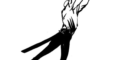
As always, you can also go to the dedicated Al’Rashad site.
9
Jun
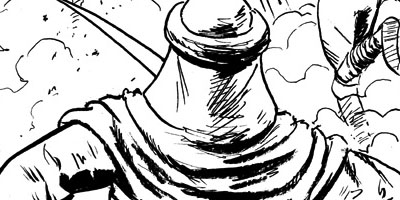
As always, you can also go to the dedicated Al’Rashad site.
2
Jun
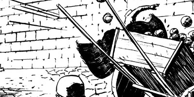
As always, you can also go to the dedicated Al’Rashad site.
26
May
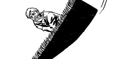
As always, you can also go to the dedicated Al’Rashad site.
19
May
As always, you can also go to the dedicated Al’Rashad site.
5
May
As always, you can also go to the dedicated Al’Rashad site.
14
Apr
As always, you can also go to the dedicated Al’Rashad site.
7
Apr
As always, you can also go to the dedicated Al’Rashad site.
31
Mar
As always, you can also go to the dedicated Al’Rashad site.
18
Mar
…because apparently people think “greywashing” somehow sounds unethical. I don’t even know, folks.
Anyway, some more samples of what shadework would look like, and I wanted a cross-section of pages here so:
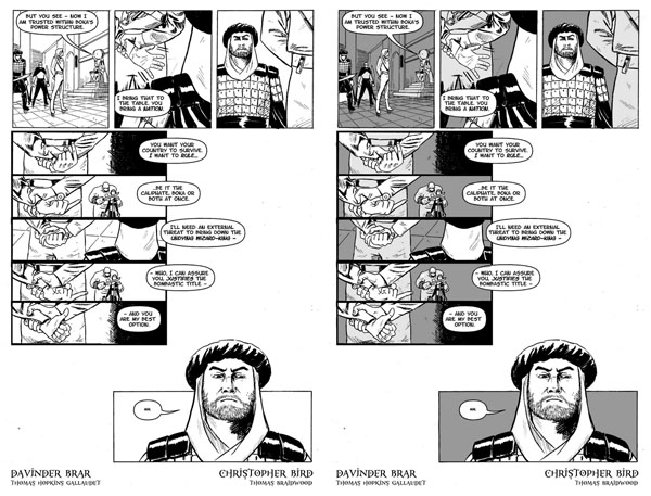
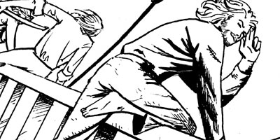
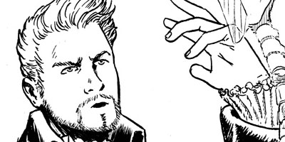
This is another night-time page, but I’ve lessened the shadows (we have here a 20 percent grey and a 40%) because it’s indoors in a lit room. This time the shadework’s purpose is to illuminate two things: Fezay’s expressions and Alric’s hands, both of which weren’t quite as prominent on the page as they could be in a straight black-and-white. (I also note that shading potentially lets Davinder go back and add details that otherwise would have detracted from his linework in the foreground.)
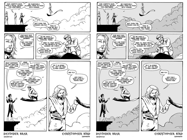
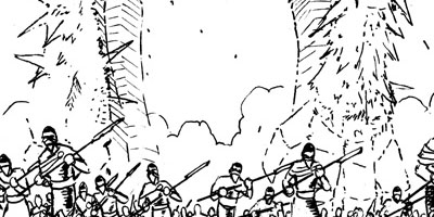
This is a good example of shadework for a daytime page: here it’s a 10% grey and a 20% grey for the clouds. These aren’t very dark greys but I think they’re just enough to make Vurmik really pop in panel three. Also note that using the grey on the clouds allows for some additional emphasis linework in white, creating additional texture on the crowds via negative space.
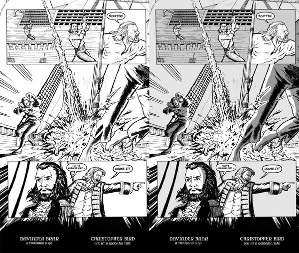
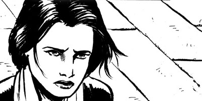
This is an example of a three-tone page: 10% grey for the basic background (both the sails and the sky – neither are terribly important to the panel so I want them to become background), 20% for the ship deck in the first three panels (to differentiate them from the surrounding sky on the page, and to push that Gundring sailor into the foreground and attract the eye to him as you start reading the page; the 20% grey isn’t necessary for the deck on the page’s feature panel because that panel is being lit up by the fire) and 45% grey for shadow effects created by the fire (which – yes, it’s daytime and realistically the shadows wouldn’t necessarily be that deep, but that dark grey really sells the fire).
"[O]ne of the funniest bloggers on the planet... I only wish he updated more."
-- Popcrunch.com
"By MightyGodKing, we mean sexiest blog in western civilization."
-- Jenn
