Well, sort of. This is just a canvassing-interest post.
One of the things we’ve been considering as a bonus for the collected edition of Al’Rashad – and the collected edition only – is the use of greywashing to make pages more dynamic. It’s not too complex but it can really make pages pop sometimes. As a comparison example, here is Book Four, Page Eighteen, both the original and a rough greywash applied:
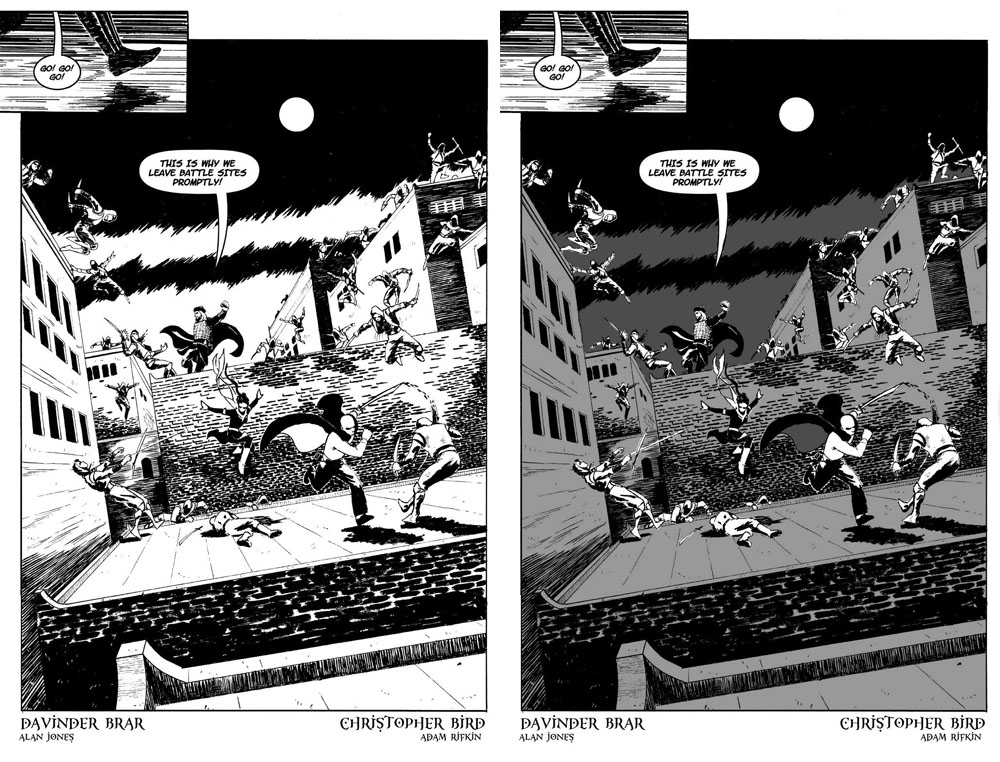
Click on thumb for larger version
Greywashes like this can work as a semi-replacement for colouring in black-and-white comics (and truthfully, unless someone throws a truckload of money at us, colour is probably prohibitively expensive at this point given the number of pages that would have to be reworked). The effect can be quite useful on pages like this one to make individual figures “pop.”
So, comic readers: is this a value-add for you, or are you thinking “man, this is like Lucas and the Special Editions all over again?” Feedback appreciated.
UPDATE: So right now it appears that the majority of comments so far favour the greywash, but people who hate it really hate it. A few notes here:
1. Like I said: this was an extremely rough greywash, using two tones (a 60 percent grey and a 30 percent). I did it in about 45 minutes in Photoshop and I’m still not sure about the values – I really like that 60 percent to flesh out the night sky on this page, for example, but would want to test lighter greys for the buildings. If we end up using greywash in the collection, we’ll be putting a lot of thought into individual pages and consider using three tones or even one tone rather than two on a page by page basis (you have to be careful with three tones, though, since three distinct greys can muddy the page; the third tone has to be used very sparingly). More to the point, there will be plenty of pages (the tunnel sequences in Book Four, for example) where the greywash simply isn’t necessary or desirable.
2. There’s no question that greywashing changes the reading experience of the book; it simulates, to an extent, the effect that color has on the reading experience, and what color does to a reading experience is create greater emphasis on the individual elements of the scene. (It should be noted that Davinder’s inking style means that the other major method of creating greys in black-and-white art – stippling and linework – isn’t really available to us as an option.)
3. If we ultimately decide to go with the greywash, we’ll find a way to collect the original edition as well – most likely bundling a digital version of it along with the digital version of the greywash, maybe include a coupon for the digital with the physical collection, etc.
Anyway. Right now we’re leaning towards it, but I’ll do some tighter greywashing on a few more pages next week so we can get a second round of opinions.


Related Articles
34 users responded in this post
The greywashing looks awesome, adds a nice depth to the page. It’s also easier on the eyes than all the white although that could just be an effect of the computer monitor.
Whoa.
I’m not sure exactly the type or level of effort that goes into this effect, but I think it’s worth it. The contrast between the grey and the white brings out a few details that I was losing in the background — it’s very impressive.
Davinder’s art on its own is already gorgeous. The value added with greyscale seems kinda low since the source is already so good.
Value add. I have trouble with the normal grey scale you guys use normally. It’d get me to actually buy it.
Hugely in favor of the greyscale. I love the art, but the stark white sometimes gets to be too much for me when I’m reading the pages — my eyes get lost in it. The greyscale fixes that.
I love it. Huge fan of the whole series and very excited that things are falling into place for the collected edition.
I would absolutely buy a printed volume with the greyscale wash.
I think it works great on this image – I agree with the above folks that Davinder’s art is beautiful but this helps draw the eye around the page more.
I’m curious how it will look on less detail-intense pages, but in general I think this would make the collection even more of a “must buy” than I was already considering it.
Okay, I feel bad for saying this, but that just looks awful to me. Washed-out and blah. I don’t see this “increased contrast” you speak of.
I would go so far as to say not being able to get Al’Rashad in the original way it was drawn, which I absolutely love, changes it from “must buy” to “will not buy” for me.
My two cents are to go with the grayscale; the added clarity and depth are huge value-adds.
Do it. How soon can I send you my money?
I’m torn between the two – I like the clean starkness of the original, but the greywash is appealling too, possibly because it gives me a huge nostalgia kick for the old B&W & greywash Marvel/DC reprints of my youth.
I’ll buy the collection either way, but if pushed I probably would have a very slight preference for the greywash version.
I would buy a collection in either case, but I like the greyscale.
Neither is a deal breaker, but I prefer the black and white to the greyscale. I think it looks more dynamic.
B&W.
Also, how much money is a truckload?
I like it, but it makes the scene a bit darker. Looks good for a ‘night-scene’, any chance we could see an example of a daytime scene?
You guys, the greywash is so awesome.
I honestly have given the comic a pass, as interesting as the content seems, because I find the stark black and white artwork too hard on my eyes. However I looked at the greywashed version of that page and I WANTED MORE. If you did that to your comic you’d hook me as a new reader. And yes, I’d also consider buying the book to be able to read it (although I do think it would be awesome to have that style art online as well)
This is a great way to enhance the focus in a scene, but for some reason I dislike the effect it has on the sky.
I will super send you money. But I can’t send you super money.
Go look at the difference in the following elements of the page:
1. Kahal’s sword
2. Rayana’s knife “moovle” line
3. The two assassins climbing up onto the nearer building on the center-left of the page
4. The two assassins running along the buildings at top center-right
5. The two assassins jumping down from the center-right building (not the one vaulting down at far right, that one doesn’t change really because he’s in front of a particularly black bit)
6. The assassin vaulting down who’s only partially contrasted by the black ribbon of ink across the sky
7. And even Fezay’s sword, which is now distinctly toned from the sky behind him.
All of these elements of the page in the original version are a bit indistinct or missable because they are white things on top of mostly-white or entirely-white background things; you have to rely on the linework to understand what’s going on and viewed at a distance or with a glance, you can miss them, and the page can just become lines rather than individual story elements. The use of the greys can make these far more distinct.
Zipatone or GTFO.
My knee-jerk expectation was that I’d prefer the original, non-grayed version. It would be cleaner and less dark, wouldn’t look muddy.
But looking at them side by side I realized I really prefer the grayed. Rather than washing things out, it does make them pop. And is far, far better at showing the scene takes place at night. In the original, only the presence of the moon really does that and, with all the white space, it now looks to me (with the gray version right next to it) to be too bright for a night scene.
I think my original expectation was because “improvements” usually make things worse because they aren’t really driven by a desire to improve things, but simply because (Lucas-style) then can now be made.
But I’m comfortable that you won’t be using gray just because you can and that you’ll use it in ways that do truly improve the presentation. Put me down strongly in the “add grays” column.
@MGK: Go look at the difference in the following elements of the page:
I didn’t even notice Rayana’s knife “moovle” line in the original, although I suppose I could have inferred it from the pose of the assassin she hit.
And you’re absolutely right about the gray bringing out the various assassins better. Even without looking at the particular elements but just the page as a whole, the grayed version is FAR better at giving the impression of a large number of assassins swarming toward them.
Graywash. Definitely. There was nothing wrong with the original, but it is improved noticeably by the gray.
Like Jacob said, I like it for the night scenes. Huge improvement. I’m not sure about daytime scenes, though. Greywash does bring out the details, but maybe stark and bright brings something to the table when your comic is set in a desert city at the edge of the ocean.
I’ll buy the comic either way, though.
You’ve already posted your update but just wanted to chime in that personally I’d give a big thumbs up to graywash – think it really helps add depth to b&w art generally – and would be a nice compliment to all of Davinder’s detail specifically.
I prefer the graywash.
Showed it to my wife, who said that the B&W one was far too cluttered and she had a real problem working out what was going on, and the gray one was much clearer.
It looks like I’m in the minority, but at least for that page, I _vastly_ prefer the B&W over the greywash–it made the page feel *more* washed-out & blah to me rather than *less*. Add me to the column of “*really* don’t like the greywashed version”.
Looking back over it with the updated comments about greywash technique in mind, I think a large part of my problem *may* be that the lighter wash isn’t light enough, and there isn’t enough variation in shading among the various sides/tops of buildings, which the B&W gets away with by being two-tone (and anyone used to seeing B&W has to have already mentally adjusted for that), but adding pretty much the same grey to everything resultin in a flat/washed-out appearace.
I like the graywash a great deal, but definitely feel like a lighter grey on the buildings would be best.
I’m pro-greywash, especially since varying the strength of the tone can easily differentiate day from night and in turn alter the overall mood of the scene.
I vastly prefer the graywash over the original. Honestly, that might be the deciding factor in whether or not I buy the collection.
I wonder how many nay-sayers would change their minds if the term “graywashing” didn’t sound so dirty and unethical.
I ssssoooort of like greywash, but this was a bit heavy-handed. B&W you accept the lack of tone, but if you’re going grey, you need to get the balance right.
I’ll probably buy it either way, mind. But I’d like to see it done ‘properly’, if it’s getting changed at all.
It’s fantastic. How do I give you my money for this awesome thing y’all have created?!
The stark aesthetics of your b&w art, which I love, is lost with the greywash. So count me as one of the haters.