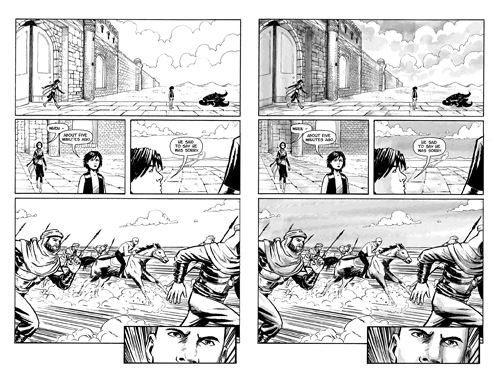
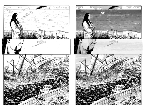
Reaction to the previous wash samples was generally in favour, with a contingent strongly holding out for unaltered original pages.
Well, this may change attitudes. Because here are some more greywash samples. But this time around, rather than me doing the washes, Davinder is doing the washes. And as you may have noticed, Davinder is better at this whole “art” thing than I am.


The difference, I think, is apparent.
EDIT TO ADD: In comments, Murc dissents:
Dalakhra and Kahal’s faces in particular just look WRONG.
This is where we have to disagree especially, because I speak for both Davinder and myself when we say that one of the main attractions of greywashing to us both is the fact that we can really visually emphasize the fact that most of the cast of this comic isn’t white.
That matters. Yes, from context the alert reader can tell that Kahal is black-skinned rather than Arabic-toned, and that Fezay is probably darker-hued than Dalakhra or Rayana, and that Alric is whiter than all of them by far. But it’s not immediately visually apparent on the page, and we both think that it absolutely has to be for numerous reasons, not all of which have to do with storytelling.
I also think it’s important to stress that although Davinder is much better than I am at this, what you’re seeing here are still roughs. (Kahal’s skin tone in the first sample is mostly untouched and we’re experimenting with ways to really bring it out.)
But: we also realize that there are some people who really love the stark white lines of the original art. We get that and we appreciate it, and we’re going to explore ways to bring an “original edition” into print eventually.


Related Articles
19 users responded in this post
Put me down with a vote for “I like it”.
Wow!
I was into it before, but sweet jebus is that pretty.
Yes. Your greywash, give it me.
I was into it before, and this just keeps selling me on it. Shut up and take my money!
Yeah, that’s definitely better. I like the greywashes a lot more now.
I was pro-greywash before, but – yeah, these are even better.
I was a vote for “I like both, for different reasons.”
I’d still like to see Davinder’s take on one or two of the pages that caused the division originally, but…. wow. Consider me won over to the greywash side.
Hmmm.
Nope.
These are a lot better than the previous graywashes, don’t get me wrong, but they still have the primary problem that ANY of the graywashes are going to have, which is that you completely lose the beautiful sharp-edged starkness of the original art. Everything ends up looking… well… washed out. Contrast goes completely to shit.
Of the example panels given, precisely one has been improved by the use of washes; the one where the bone-talon-thingy is fucking up the Gundring fleet good and proper. That one single panel looks much better. I recall having the same opinion about the last set of washes, hating them all except for the single one that was a big splintery explosion.
The rest are either “meh” or actively made worse; Dalakhra and Kahal’s faces in particular just look WRONG.
I may still pay moneys for a book of greywashed pages, but only if the extras are sufficiently enticing and it will be with great reluctance and disappointment.
I’m in.
It’s a great-artist-shades-his-own-work-and-it-looks-great shocker!
I too love the starkness and precision of the originals,
but if you’re going to bring in greys, this is how.
I dug them the first go; I dig them even more here. There’s nothing wrong with the black and white, but I think this actively improves it.
My recollection of my initial impression from the first batch was that the gray wash was an definite improvement. For this batch my initial reaction is more “Hmmm, I dunno.”
I’ll have to go back an look at that first batch to figure out why it struck me more favorably than this. Are the grays, as applied by Davinder, more mottled than those from before? That could make a more significant contrast with the “plain white” originals, a more noticeable difference.
OK, haven’t gone back to the first set yet, but I have looked at this second more and, standing back and looking at each version individually (rather than both side by side) I like the gray. Very much.
If the two creators both like the way their work looks with a particular process, I would say that is a good indication that they should use that process.
I am pro-greywash.
I have to give kudos to Davinder. I was never very good at pencil art, but I know just enough about it to know how tough it is to suggest a character’s race in black and white without resorting to overblown caricature, and even before the graywash it was obvious that Kahal was black.
I didn’t like the old greywash one bit. This? This helps sell it to me. I’ll still miss the clean starkness of the old line art, but this is still very pleasing indeed.