…because apparently people think “greywashing” somehow sounds unethical. I don’t even know, folks.
Anyway, some more samples of what shadework would look like, and I wanted a cross-section of pages here so:
Click on image for larger version
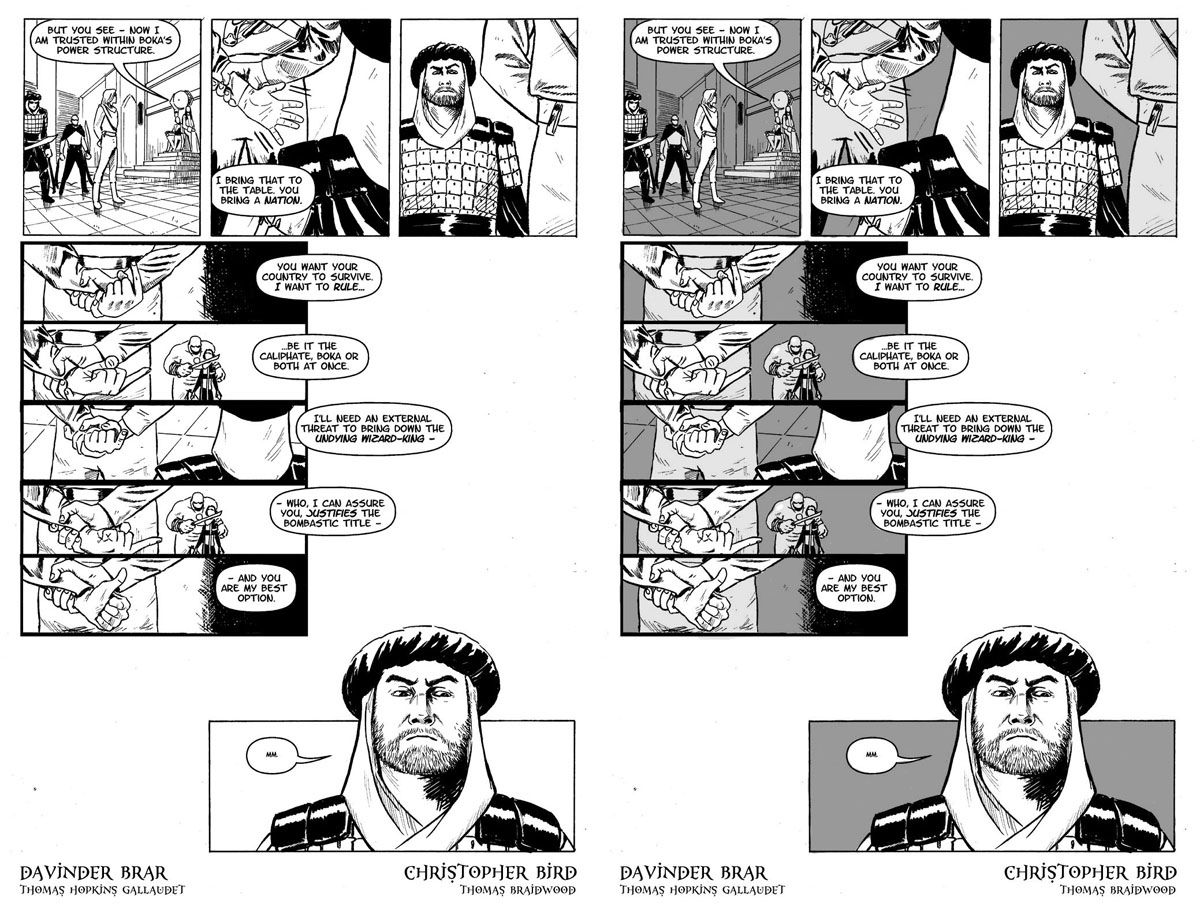
This is another night-time page, but I’ve lessened the shadows (we have here a 20 percent grey and a 40%) because it’s indoors in a lit room. This time the shadework’s purpose is to illuminate two things: Fezay’s expressions and Alric’s hands, both of which weren’t quite as prominent on the page as they could be in a straight black-and-white. (I also note that shading potentially lets Davinder go back and add details that otherwise would have detracted from his linework in the foreground.)
Click on image for larger version
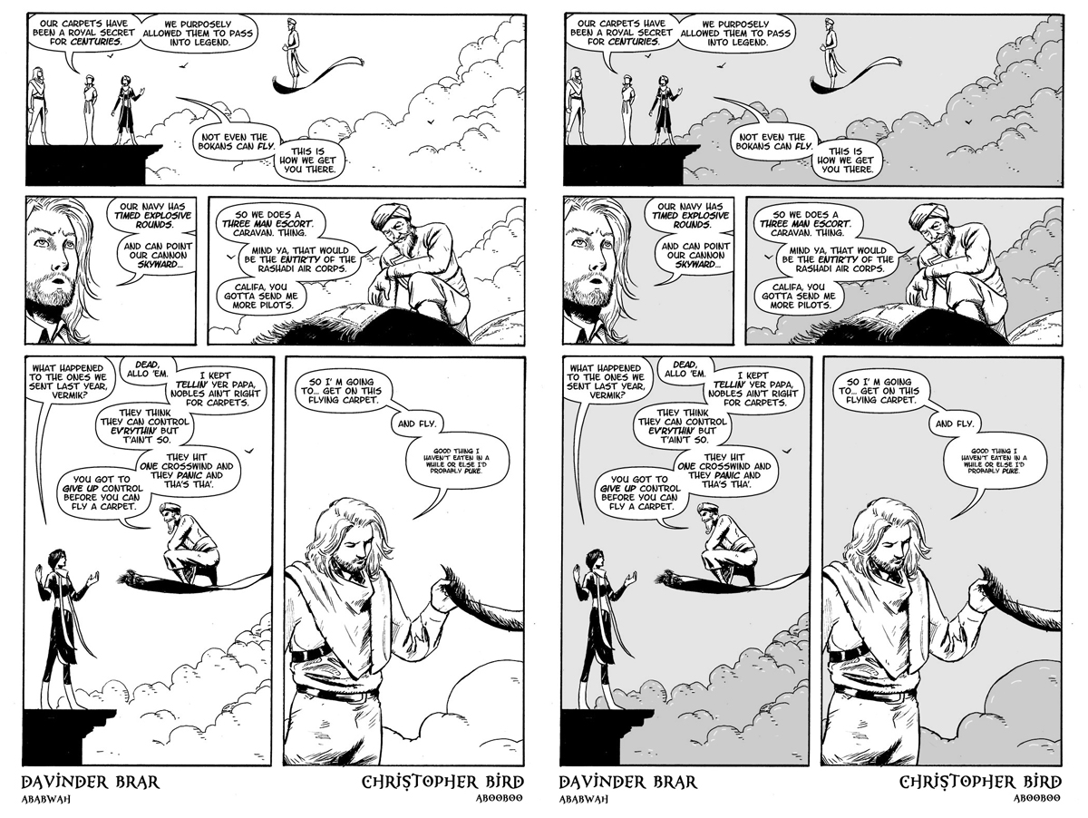
This is a good example of shadework for a daytime page: here it’s a 10% grey and a 20% grey for the clouds. These aren’t very dark greys but I think they’re just enough to make Vurmik really pop in panel three. Also note that using the grey on the clouds allows for some additional emphasis linework in white, creating additional texture on the crowds via negative space.
Click on image for larger version
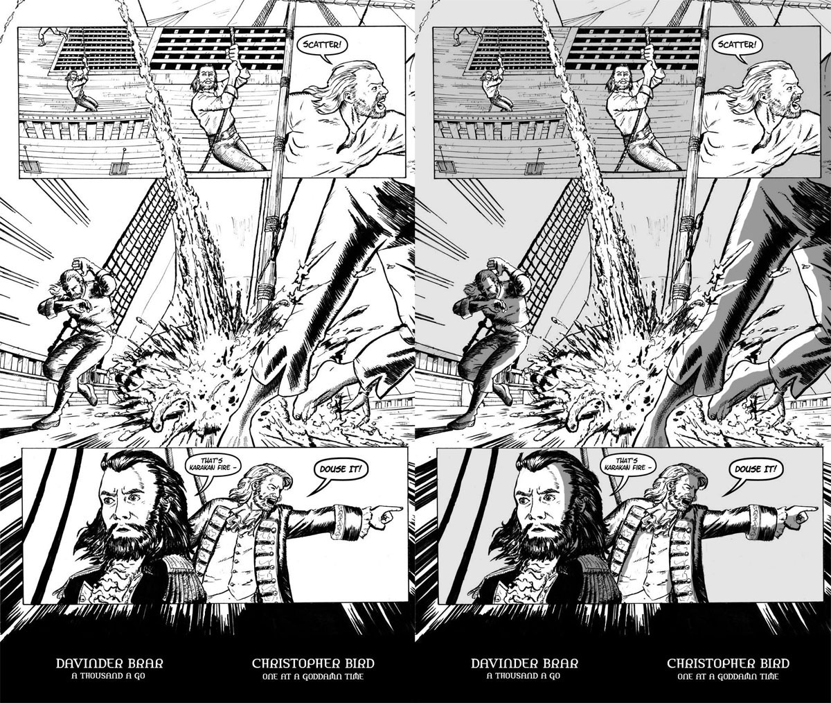
This is an example of a three-tone page: 10% grey for the basic background (both the sails and the sky – neither are terribly important to the panel so I want them to become background), 20% for the ship deck in the first three panels (to differentiate them from the surrounding sky on the page, and to push that Gundring sailor into the foreground and attract the eye to him as you start reading the page; the 20% grey isn’t necessary for the deck on the page’s feature panel because that panel is being lit up by the fire) and 45% grey for shadow effects created by the fire (which – yes, it’s daytime and realistically the shadows wouldn’t necessarily be that deep, but that dark grey really sells the fire).


Related Articles
21 users responded in this post
This just solidifies my previous thoughts. I like the “shadework” (snicker) version so much better than the original, it’s not even funny. It makes the originals look unfinished.
Enh. This post has dissuaded me. I get that the point is to make certain characters and features more distinct from the background, but in my opinion it doesn’t make them more prominent, but more makes them look like they’re completely different. In the original artwork it’s clear that the characters belong in the same scene with the backgrounds; whereas with the background shaded but the characters not, they look like paper cutouts pasted on a set.
The use of graytone to illuminate Alric’s hands in the first page particularly irks me. Yes, his hands are illuminated–quite literally illuminated, it seems, even though the rest of his body is not. It just makes me wonder why his hands are glowing.
I had no problem seeing his hands in the regular pages, or other details, in the original artwork. It was all quite clear to me, and I don’t really see the value add.
It works better in the third page posted here. The first two panels, where the character is not shaded but the background is, again has the same problem of the two appearing to be completely separate. But when the shading is applied to the characters as well, to illustrate the light source from the fire, it makes them feel like part of the same scene, and you do get a sense that there is a fire. The final panels aren’t really great, though–the distinct lines where the shading suddenly begins don’t seem to really match up with how the lighting would actually work in that scene and look more like a coloring error. Plus shadows tend to have fuzzier lines than the crisp edges they’ve been given, I think.
If you did add shading to all the characters in addition to the backgrounds, well, that might just remove details that were easier to see in the original drawings. I have to vote no on this one.
I dunno what people are complaining about. I like it. It makes stuff a lot clearer, and looks nice.
The first one doesn’t do much for me.
The next two are spectacular.
The first one confirms you won’t mess up pages that already worked fine, and the others look great. Still digging this.
And “greywash” is fine. That’s what we call it when we do it with actual watered-down ink.
Shadework version is 10000000% better.
@skemono:
I didn’t notice that when first looking, but now that it’s mentioned I can see exactly what skemono points out. By shading the pants but not the hands, the hands can be seen as being separate from the background pants. Which means they both stand out more (draws attention to them: good) and seem to be part of a different figure than the pants (bad).
First thought was, well maybe there’s a “rule” of graywashing (Screw the politically correct wimps. It’s called graywashing. Deal with it.) that a single figure should be all one shade? I actually don’t think that would work in all situations. The shadows in your third sample really do sell the fire.
But maybe when the panel is so clearly a close up on the hands, already putting focus clearly on them, additional highlighting isn’t necessary.
Overall, I’ll still very in favor of the graywashing as long as it’s used carefully.
Really? I was completely joking about “graywashing” — it’s just a funny name because it sounds like a bunch of unsavory terms like “whitewashing” or “gray market” and it’s a process of making retroactive changes that some people may dislike.
It sounds like a term butthurt comic nerds would make up: “I can’t believe they’re totally graywashing Al’Rashad!” but — and this is the funny part — it’s not.
I think the graywash look great, btw. And it helps the storytelling. The first time I read the scene in the throne room (or the rooftop ninja fight), I had no particular impression of whether it was day or night. It’s a lot more obvious with the graywash.
If you do the graywashing I will happily tell you to shut up and take my money. It looks 1000% better with it in most cases and as demonstrated by the first page shown in this post, won’t negatively affect pages that looked fine without it. Also, the ability to add more detail = win!
Okay, now I’ve seen a daylight page, my concerns gave proven groundless. Greywash is a great improvement all around.
Yes yes yes. Take my money already! 🙂
@Urthman: Fear not, your dry wit was not completely unappreciated – I got that you were joking. Perhaps MGK was overtired when he read it – unless he’s being even drier of wit, and we all missed it.
Anyway, my previous comment stands for the new pages – I like ’em both about the same, for different reasons, and will buy the book either way.
Beautiful.
… of course, for proper A/B testing, you should be releasing a greywashed Al’Rashad on your alternate universe blog, then posting to ask how people feel about a pure line-art, B&W print version.
Everything skemono said goes double for me.
Of the four pages we’ve seen graywashed so far, there’s been exactly one panel which I thought looked better for it; the one with the fire/explosion. That one really pops. The rest of it, ugh, awful. It either makes characters in the foreground look like they were cut and pasted over the background or just makes everything in general look washed out and blah.
I’m just one guy, of course. And the majority of the people here seem to really love graywashing. But I have to reiterate my point that if I can’t purchase a dead-tree version that has the original art, or at least art that looks way better than the graywashed pages, I just won’t be buying one period. I may feel obligated to if the extras and ancillary materiel are good enough (I would almost put down twenty dollars purely and exclusively for a set of really good maps) but it would be with great reluctance.
I’m in general of graywashing in general, but I can’t agree with making clouds darker than the background sky. Unless they’re thunderclouds, they should be white, or at least a lighter gray. Otherwise they look like hills covered in shrubbery.
It looks leaps and bounds better. Go with your gut and do the graywash.
Before, it looks like a rough draft. Now, it looks like a comic.
Count me among the minority that finds the grey to be a detriment. I think the best way to describe it would maybe be that with just the black and white, my mind is I guess able to fill in the void with shading or colour that isn’t necessarily there, while the darkness of the grey just flattens the image. The unshaded white elements do pop a bit more, but in the same way the part of an animation cel you know is going to move before it actually does. Maybe I’d feel differently if only lighter shades of gray, in less solid blocks, were used, but as is, I prefer the white, but would still buy it in the gray.
PS- Shadework sounds like what Jack Ryan gets Shadow Recruited for.
Unfortunately, I gotta be in the “not a fan” camp. Greywashing just made the image seem even flatter to me, because there’s not much actual shading going on. The greys are applied heavily and completely cover their subjects, and they look like paper cutouts superimposed on the backgrounds. What’s more, the grey used on most of the backgrounds mostly just consumes a lot of the fairly impressive linework, and it just doesn’t look good. The only one where it really looks good is the explosion page, where the shading really does help make the characters look layered and detailed; part of the environment rather than pasted into it. The other ones look more like when you’re reading a “the making of” colorist book, where all the characters are given completely solid colors so you can tell who’s who – but here, the solid colors are the final form. Imagine if there was a Superman book where he was just completely blue; that’s what I think when I see this. I won’t deny that Al’Rashad could use some shading (though really, there are countless mangas and black-and-white comics that lack shading and look great), but if you’re going to shade, then use shading. Draw shadows and greyscaled colors and fadeouts. Don’t just use the fill tool on all the backgrounds.
Also, clouds are not dark grey.
I greatly prefer the graywashing. It give the comic a finished appearance and directs my eyes through the panels in a way the linework didn’t. (Although I agree with TrishEM above that the clouds being darker than the sky is a weird effect. They look like thunderclouds.)
The toned pages look much fuller. Go with it.