And if you like, you can also go to the dedicated Al’Rashad site.
17
Sep

And if you like, you can also go to the dedicated Al’Rashad site.
"[O]ne of the funniest bloggers on the planet... I only wish he updated more."
-- Popcrunch.com
"By MightyGodKing, we mean sexiest blog in western civilization."
-- Jenn

Related Articles
4 users responded in this post
I can see where this is going…
hahaha, I love the setup. Can’t wait to see the next page!
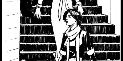
I really like the art design in this one — the two deep verticals, with hidden extra symmetry/balance because of climbing in one and descent in the other.
Boy’s legs should be really hurting. That torch is burning bright right below him. You can’t really be that near above a torch. Try it sometime.