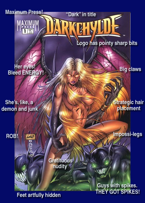
So Poptown and Sims and Church are busy competing for the “most 90s comic book cover ever,” and I think I have a contender right here.

I would like to make the additional point that DarkChylde more perfectly encapsulates the 90s comic experience than any of their entries, because as a title it lurched from pathetic tiny publisher to pathetic tiny publisher for the better part of a decade, finally collapsing with a “Last Issue Special!” one-shot in 2002.


Related Articles
37 users responded in this post
Also her name is spelled with an unnecessary “y”. That’s bonus points for sure.
I dunno, Chris. No guns, no pouches, no foil. I think I’m gonna have to give the nod to Church.
I dunno. If she had more pouches and they were embossed, it’d be solid.
Isn’t there a cover somewhere with Glory and Avengelyne making out while wearing giant shoulderpads? I’m pretty sure there is, in which case I vote that one.
No way. Church has this one in the bag. His was the entry I looked at last, but as soon as I read about this contest, something just like that Blood Hunter cover popped into my head. If it had a whole bunch of malformed, out-of-proportion crossover characters in the background, it would be absolutely perfect.
Wow. That one might be hard to beat (I note though that it’s a bit more late nineties than the other contenders). If anything is going to out do it soft-core-demon-talon-spike-porn-wise, though, I imagine it’d come from Top Cow. Or did they only go into tittie-blade overdrive after the new millenium?
Y’know, I started reading American comics in the 90s, and all of the spiky-shoulderpads, foil-embossed-covers, hidden-feet, improbably-enormous-guns, gritted-teeth-with-spit-strands, balloon-breasts, fly-by-night-publisher stuff completely passed me by.
I’m not sure how it passed me by; I just know it did, because when people say “comics in the 90s” I think of Sandman and Strangers in Paradise and Paul Jenkins’ Hellblazer run, and I have to remind myself that that was when other people were reading DarkChylde… or looking at it on the shelf and crossing themselves.
I guess this is a different “Darkchylde-with-a-Y” than Illyana Rasputin. There seem to be a number of similarities though. Was plagiarism also ’90s?
If you like this kind of thing, or if you just like laughing at it, or if your eyes are masochistic, head on over to Progressive Boink and check out their 40 worst examples Rob Liefeld drawings.
(Full disclosure: I was a fan of Liefeld’s work on “New Mutants” back in the day and am able to re-read those issues now without cringing.)
This contest randomly brings up not-that-old memories. We didn’t have a lot of comics in the house during the nineties, but there was one book. A big green guy who was not the Hulk – he had a long tongue with spines or something on it, and dreadlocks or something. He had what I’ve recently learned is a Liefieldian physique. I remember being kind of baffled by his size. I think I said that you could make a nice fort in and on his shoulders. And for some reason California had fallen into the ocean. *shakes head*
Don’t forget the stupid spelling of “Child”… an extra E and a Y thrown in for k00l factor. Though it is pretty damn close, Darkchylde needs some improbable weapons and maybe a belt with pouches to really work it.
Sorry, man. I gotta agree– Church has this one.
This is a close second, though.
Maybe if you found an issue of WILDCATS where Grifter is holding his gun sideways or maybe Grifter and Zealot together.
This isn’t bad, but it can’t compete with the big guns, sorry.
I think Poptown takes it since that’s the best (worst?) example of pointlessly shoehorning classic characters into the 90’s American mainstream comics zeitgeist I’ve ever seen. I actually have that issue somewhere too, and it shames me to admit that I found nothing wrong with it at the time of publication. My only excuse being I was 15.
I think that if I am forced to choose, I will say that Poptown wins. First of all, it rapes a classic comicbook, flaunting whatever made the FF work in the first place. I can just picture the effort to make the FF “grim an gritty.” Now, admittedly, their shoulderpads aren’t that impressive, but they have got insane guns, pouches and Sue has a fine forced bad-girl attitude.
Also, I admire the attention to detail. Notice how the Thing has a helmet for no reason whatsoever. The only member of the FF who has natural armor takes to wearing a helmet and nothing else. Much thought has clearly also been given to Johnny’s leather jacket. Yes – notice how he wears a leather jacket while having flame on. Good thing that real leather doesn’t burn, eh? His grimace accents the leather jacket most well, and if I am not mistaken, he is wearing spiked knuckle dusters. Also, pay attention to the fact that all feet are microscopic, or hidden away, as feet should be. (They have the right idea in ancient China).
Reed, clearly aware that he will never be badass, compensates with LOTS of pouches. A particularly well-done detail are the two metal rings above Sue’s stockings/trousers/boots (I honestly don’t know what to call them). In battle, it is particularly important to protect your thighs, something which a bad girl like Sue is well aware of.
The classy, yet understated, “This is not your parents’ comic magazine!” on the top of the cover, shows how this is clearly the superhero magazine for the 90’ies “grim and gritty” comic book fan.
Actually, at the time, the Thing’s face was all scarred up. Thus the helmet. It was still a really stupid look for him though…
How bad was it Lurker? I mean, as compared to his usual look?
It’s Poptown for me too. The bonus points for outrageous bandwagonism tip the balance for me. I feel mention shoudl be made of the repeated cover abuse inflicted on my teenage years by the covers of Cyberforce.
http://www.coverbrowser.com/covers/cyberforce
Indulge me for a moment for a bit of a keyword rundown of the lowlights:
#1: scream, claws, footless, angst
#3: scream, claws, footless, angst, skulls, artist name, ribcage
#4: gritty, footless, guns, cape, boobs, roster with trademarked names (!)
#8: Gratuitous McFarlane Ribbon Effect (GMRE)
#10: Guns, footless with style, thigh straps, anatomy, GMRE
#12: Boobs, scream, GMRE
#17: Guns, angst, boobs, anatomy and additional WTF
#22: Guns, pouches, artist name, mouth-to-mouth vomiting
#32: Heroine Thong Wedgie (HTW)
#34: Boobs, anatomy, skulls, HTW, ribcage
ass-length ponytails as standard.
Heksefatter: If I remember correctly he had a rather large chunk of the left side of his face completely missing. I want to say from jaw to just above and behind the eye. In case anyones wondering, he got it from Wolverine.
Wolverine’s a jerk.
I have to say, this one *does* get points for ROB! being the artist.
Wow. Those Cyber Force covers… just, wow.
I think Church has to win this one. Blood Hunter is just *too* perfect, something you could put in a museum as representative of ’90s comic book trends.
While this cover is also quite good, it’s more illustrative of the “’90s Violent Presumptively-Hot Chick” subgenre than of the ’90s as a whole. Plus, more to the point, while pouches, improbable guns, cross-hatch specialists who can’t draw feet, etc., have largely vanished, *this* kind of thing is still with us in the 21st century (e.g., the works of Michael Turner.)
People pointed out why Ben had a mask, his face wasn’t healing from Wolverine slashing it. Johnny had the leather jacket to help is flame actually. It drew more pure oxygen out of the atmosphere or something, making the flames hotter, better, faster, stronger.
The leather jacket drew oxygen out of the athmosphere? Now that makes sense. The spiked brass knuckles must have allowed his flame to reach higher temperatures then.
Right now, in this very moment, I am wondering how a “grim and gritty” 90’ies version of Rex the Wonder Dog would look like. Rex would PWN wearing badass shoulderpads, leather jacket and a shitload of pouches. And he can carry his oversized gun in one of his front paws.
Dan: The one where they have those itty bitty waists? The breasts and butt were somehow presented at the same time? That cover was the first that came to my mind, too.
Joysweeper: Was he some sort of alien and was fighting off an invasion? There may have also been a kid with reality warping powers that beat him up with a hockey stick?
Could they not draw feet in the ’90s? Or were the anti-foot-fetishist prude censors responsible? I imagine barely concealed tits are still probably more kosher than the mildest of fetishes.
There were people who would draw bare feet like they were standard hero boots. No toes or anything.
Of course, not all of the 90’s were bad.
Re: Joysweeper
That actually sounds a lot like Hulk 2099.
http://en.wikipedia.org/wiki/Hulk_2099
Does that look familiar?
Here’s a truly gnarly 90’s style image that features: Angst, GMRE (Gratuitous McFarlane Ribbon Effect), claws, strategic placement of accessories, and a nice spread eagle shot.
http://tinyurl.com/6y2jq6
I don’t know, Zen. I won’t deny its merits, but where are the pouches and the shoulderpads?
The main character’s not wearing enough clothes to be able to use either shoulderpads or pouches.
and its got improbably anatomy too.
The Glory/Avengelyne cover can be seen as part of this writeup at Sequential Tart, but there’s a bigger version here: http://www.sequentialtart.com/archive/mar01/images/0301/bb0301_01_large.jpg
From the big to the little:
It’s got chrome, no logo at all (though it stars a grim heroine whose name is misspelled with a “Y”), spinal dysplasia (SWAYBack^tm), Rob!, cut-off feet, Extreme Studios, pleather, face-framing helmet, grimaces, big- ass swords held by no human anatomy, big-ass asses held by no human anatomy, visible bikini waxing, armored studs on the boobs, spikes on the crossguards of the swords, and–I think this is my favorite detail–ammo pouches on GARTERS. You can spot this as ’90s from ninety feet away, and it just gets more ’90s the closer you get. The Darkchylde cover almost could have come out from Avatar or Turner Studios last week, but Glory/Avengelyne could only have been made in the 90s.
I don’t think those are armored studs on the boobs, Kevin. Those look like badly drawn reflection spots, to me.
Also, spiked crossguards are actually not so uncommon in history. There is an extremism of it in 90’s comics, but this example is not so 90’s.
I made the mistake of checking up on the Wikipedia entry. It’s probably vapor, but they claim that a movie is in the works. That could be really neat (because hey, the character does have a nifty storytelling engine) or really terrible. Based on Hollywood’s track record and my general crankiness about cinema, I expect “really terrible.”
http://www.superdickery.com/index.php?option=com_content&view=article&catid=29%3Aconfounding-comic-covers-index&id=1194%3Asanta-is-qtotally-extreme-d00d&Itemid=32
Just look at this! It has the muscles, the big weapons, the pouches (which is even better, considering that he has no need for ammo), the hidden feet, the wierd anatomy, the ribbons and an alright grimace.