It has been a while since I posted on this here blog so I figure it is time that I discuss a subject of critical importance! And that subject today will be the flags of New Zealand.
New Zealand is a pretty awesome country! I mean, think of all it has going for it. Like, they made Lord of the Rings there. And the Maori warrior totally almost beat the Shaolin monk on Deadliest Warrior, which is like, I dunno, coming within a point of beating whatever college team is big this year in basketball. (Is it Kansas? Duke? The one with the bulldog? Let’s say it’s the one with the bulldog.) And their national sports teams dominate in cricket and rugby and other sports I don’t know anything about, which means that sooner or later they will play a for-reals sport and win at that too. Clearly New Zealand is a country on the rise.
But their flags all suck!

Okay so this is the flag that New Zealand uses right now. You will note that they still use the Union Jack, which is dumb. Look, New Zealand (and Australia too, you should pay attention – what is it with the southern hemisphere?) – you’re not actually British any more. This is to the good! You can create your own traditions! Or, if you want to follow the Canadian example, you can borrow them from elsewhere and then pretend they are yours.
Look at the rest of the Commonwealth. None of us still use the Union Jack. Not even the failed former British colonies in Africa use it! It’s like, you know those commercials for the “pull-up” diapers for toddlers who still poop themselves but want the dignity of putting on their own diapers? (Do they even have those in New Zealand? Maybe you just use a sheep.) That’s what the Union Jack is when you’re not British and it’s on your flag.
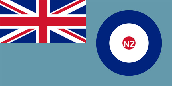
This is the flag of the New Zealand Air Force, which reaffirms two beliefs I have about all air forces everywhere:
1.) they really love pastels
2.) They forget who their flags belong to if they don’t, like, add initials to it or something

This is an “alternative” flag that is used by Maori (some of them) and New Zealandish hippies who wish they were Maori (lots of them). In true hippie style, it is ugly as fuck. The green thing is a koru, which is a stylized representation of a fern. Unfortunately, it looks like a giant tentacle. I do not think this is good advertising for New Zealand. “Come to New Zealand! We have tentacle monsters. Which seemingly wear black T-shirts.”

I don’t get why ferns are so important to New Zealanders but apparently just about all the substitute flag designs have ferns on them. Do you guys really like ferns? We were pretty much stuck with the maple leaf thanks to colonial traditions; isn’t there a more exciting New Zealand plant to put on the flag? Like, Wikipedia says New Zealand has fourteen different species of carnivorous plant. How awesome is that? You could have a plant on your flag that goes RAAWWWWR. Like this one. Okay, maybe sundews don’t go RAAWWWWWR so much, but you get the idea. Like maybe there’s a little bug trapped in a sundew going “help meeee, help meeee.”
Anyway, this flag is okay but it reminds me of when I was fourteen and wore black T-shirts with white writing on them and thought I was hardcore. On second thought, because of that, this flag sucks.
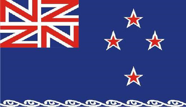
Now some of you are going to say that I did this in Photoshop but no, it’s for real, and apparently it won a “redesign New Zealand’s flag” contest. That “new version of the Union Jack” is flawed in two ways. First off, everybody knows it’s just there because you couldn’t get the real Union Jack. It’s like when I was eight and my mom got me Mega Blox instead of Lego. It’s just not Lego! I WANTED LEGO!
Ahem.
Also it looks like a band logo. Like the entire country is a big fan of Nu-Zone or Ned Zeppelin or Nostrils: Zero. I got to admit though this looks like a flag you could really metal-thrash out to. This is a flag that wants you to fling the horns.
And what is with those stars? Those are some extra-pointy stars.
History lesson: the original flag redesign of Canada was blue stripes with waves and a green maple leaf and a logo and a motto and a little photo of John A. MacDonald doing the polka in the top-left corner and a “STOCK PHOTO PROPERTY OF ALLPHOTOS.COM” disclaimer on the bottom right corner. Then we changed it. Why did we change it? Because the first one was too busy. It had too many things. So we got rid of all of the bad things and simplified the colour scheme and hey presto, flag that doesn’t suck.
You see where I’m going with this, right?
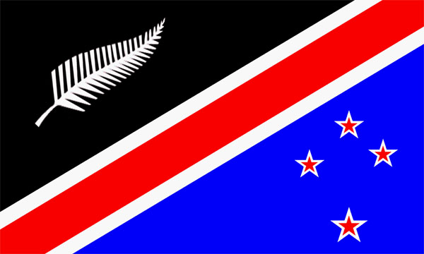
GAY

Out of all the designs I’ve seen this one is the best. It unifies all of the elements of New Zealand: the blue seas, the red blood of sheep sacrifice, the strange New Zealandese obsession with ferns, and the four stars that represent New Zealand for some reason. It is well-designed and pleasant to look at. It is the sort of thing any person of New Zealandic descent would be proud to have on their coffee mug or lapel pin, and really, that is the major reason for flags.
However, I have been working hard and I think I have an even better flag for New Zealand!

Eh? Eh?

Related Articles
34 users responded in this post
Just a little comment from the South Hemisphere: the four stars are the Southern Cross, a constellation which is only visible from down here all year round (i think it can be seen from some tropical place too) and which points towards the south much like the Little Dipper. That’s why it’s in these flags, together with the Union Jack (as in the aussie flag) it says something like ‘hey! we’re kinda British, only not, and we’re waaaay down south!’
I too have long questioned the use of the Union Jack in other flags.
You forgot, in your list of things that are cool about New Zealand, the fact that they have some of the craziest mofo horror-movie makers ever down there. Not just Peter Jackson, who has a horror movie with a kung-fu priest and a guy who straps a lawnmower to his chest, blade outwards, and runs headlong into a crowd of zombies. No, there’s also the guys who made “Black Sheep”, a horror movie about genetically-engineered killer sheep that turn people into weresheep with their bite.
That’s some quality horror movie insanity.
Also it would probably be best if that flat didn’t look almost exactly like Australia’s flag. It’s like showing up to the Commonwealth get-togethers in the same dress.
We are well aware our flags are sub-par; our national anthem is even worse. For some time now, we having be trying to work towards a combination of blood, stars and fernery that truly symbolises our national culture. To no avail thusfar.
Currently various Maori groups are convening to try and choose a flag to represent the collective Maori nation. I suggest you submit your entry MGK.
As New Zealand is officially Middle Earth now, why can’t they appropriate the flag of Gondor?
The sheep look perplexed.
I do rather like the next-to-last flag, with the fern and the southern cross.
Needs more cowbell
Agog:
I remember being in a big game of Trivial Pursuit which involved one of my lecturers, who is from NZ. There was a question: “Which national anthem is the following quote from?”
After deciding it had to be an English speaking country, they had only a few candidates. He was certain it wasn’t the NZ anthem. They went for Australia. It was NZ.
Mind you, I’m sure most countries could have the same thing
One of the big issues of flag design like all heraldry is the need to recognize them from a distance against all types of backgrounds. Which is why busy flags look like shit, indistinct blobs. Also flags that can easily be drawn in school by kids with crayons ups the level of nationalism in the population at large.
“I always knew, it would be the ferns.”
I dream of one day living in a world where people don’t think it’s cute or funny to use the word ‘gay’ in that way, but I may have to wait until after the death of Judd Apatow.
It took me until I finished the post and started to reread to realize that this was Flapjacks, and not MGK on a bender. (Yes yes, I’ve heard the “Fight Club” theory.)
The use of the Union Jack in the upper left corner reminds me of the field of stars on the American flag. How many other (non-Commonwealth) flags have that layout?
Which National Anthem Is The Following Quote From, play-at-home edition:
“Ruler supreme, who hearest humble prayer”.
No using google. 😛
You’re kidding, right? They would be flooded with tourism if they could increase their connection with giant tentacles. Everybody loves cephalopods.
While I absolutely concur that the second to last flag is the best design, there are worse flags out there than those that use the Union Jack.
Look at the state flags of the United States and how many of them use those god-awful state seals for their flags. There is simply no excuse, in this day and age, for any flag to be as mindlessly butt-ugly as the Wisconsin State Flag.
http://www.50states.com/flag/wiflag.htm
Behold, the seal means so much to its people that they had to stick “Wisconsin” on the flag so people would know what the hell they were talking about.
The eight flag reminds me of the logo for major league baseball. Now, individual’s mileage my differ on this, but I can’t say I’m a fan.
SmR: I must admit that I was on to the fact that it was Flapjacks pretty early. MGK is a lot of things, but I personally wouldn’t add modesty to them. When you title a blog post “Sarah Palin is still an idiot.” then I’m very aware that he has opinions and so couldn’t see why he would title a post that. So I immediately checked to see who’d posted it.
Minus the Southern Cross, that second-to-last one could be a kickass National Fernball League logo.
“That’s what the Union Jack is when you’re not British and it’s on your flag.”
Union FLAG if it’s not on the jack staff of a ship. It’s the flag of the British monarch, not of the country- we just happen to use it. Think of it as showing props.
The monarch therefore knows they can count on Australia, New Zealand, Tuvalu and Hawaii to have their back in royal rumble, should any two-bit nation unwisely decide to ‘throw it down’.
On the plus side, the giant tentacle could attract Cthulhu tourism. And you can fail your sanity roll by just looking at it.
So there’s, what, 3 million New Zealanders? I’d guess you’d see at least that many go through a Vienna youth hostel on a good day (therefore, some Australians are faking!).
So wouldn’t the ideal flag be a sign that said, “Country closed. Gone backpacking, back in 2012.”
(Your opinions matter to us: email NewZealand7@Gmail.com?)
There is simply no excuse, in this day and age, for any flag to be as mindlessly butt-ugly as the Wisconsin State Flag.
http://www.50states.com/flag/wiflag.htm
Never mind ugly — what is the baking soda arm doing on the Wisconsin flag?
@SmR: That’s pretty common, actually. In Australia and New Zealand’s case, it’s a Blue Ensign, and in the case of the current flags of Ontario, the same thing is done on a Red Ensign (which was the former flag of Canada).
See here and here:
http://en.wikipedia.org/wiki/Red_Ensign
http://en.wikipedia.org/wiki/Blue_Ensign
NEW ZEALAND HAD THE FLAG BEFORE AUSTRALIA!!
This isn’t two people showing up at get-togethers in the same dress. This is Australia showing up, seeing the nice Dress that New Zealand has, and then /going and buying one just like it/.
That’s a pretty awesome suggestion though, Flapjacks. Think you can fit a hobbit on there somewhere?
What’s the problem with the union flag? It is clearly the second best flag ever, as it symbolises scotland’s ability to be magnificent bastardry, and the english dickishness of completely excluding the welsh from having any representation in the flag.
However the first ferny one is better, as it’s not just a tentacle, it’s a tentacle reaching out and curled up as if grasping for something – it symbolises not just that New Zealand clearly has an invincible army of laser powered cephlapods, which it better have if it’s going to go with that one, but with those laser powered cephlapods new zealand will reach out and crush any that oppose her.
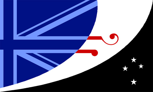
Did you pick the nazi/roman lightning bolts thing in the last one for a particular reason? And isn’t there a law against canadians actually ending anything with “eh?”
Woah woah woah. Wait just a minute here. New Zealand does not dominate in cricket.
@Fred: And don’t forget Cornwall. Could get away with a few black stripes on the flag.
I take it you chose to ignore this version of the Maori flag because it’s totally awesome and leaves your argument in tatters Mr Flapjacks?
http://digitalwhitireia.com/2008websites/L4-Web/Lisa_gripp/800px-Flag_of_Maori.svg%5B1%5D.png
The flag should have the Rhymenoceros and the Hiphopopotomus on it…
Ought to have a red/white/blue tentacle. Cthulu is a patriot!
well, truth be told any flag prominently featuring a leaf is kind of sad, really. The new zealand flag would be much more accurate if it were just i picture of a jar of marmite, since thats pretty much the only thing they eat.
Also, the canadian flag would be improved, if it were a silouette of the USA wearing a funny looking hat, with an arrow pointing to the hat.
Hilarious critique! I see that the latest post here is from six years ago, so I suspect moderation has closed off new comments. I continue typing nevertheless. The Koru flag you refer to as a hippie flag was designed by Hundertwasser. I used it on a brief bio I wrote on Hundertwasser years ago on HubPages, called “Hundertwasser: Spirals Turrets and Toilets”. I kinda liked it, but I know nothing about art. I liked the one you labeled “GAY”, for example. The “contest winner” flag here is atrocious. Immediately reminded me of a swastika. I agree with your final pick, and your rationale.
Obviously flags are more important and long-lasting than web pages, judging solely by the dates of the comments here. This is the most interesting (of many very interesting) TED talks so far in 2015. All about design and flag criticism. Design of everything really – radio, tv, TED talk, writing, social constructs, really great stuff. TED comment areas are stultifyingly banal, because they moderate out anything that sounds like criticism. I wrote a finely tuned little 3-paragraph comment on this TED page, self-mocking, self-conscious, perfectly in tune with the medium and message of the talk and the design of the talk, (which is the very essence of criticism and deconstruction) and it got modified away:
http://www.ted.com/talks/roman_mars_why_city_flags_may_be_the_worst_designed_thing_you_ve_never_noticed
A friend of mine once said, NZ is a garden of God