No Who’s Who this week, as momentous events necessitate a pause: namely, the publication of Archie #600, the now-notorious “Archie proposes to Veronica in an imaginary story” issue.
Now, back when the issue was first announced, I took the opportunity to make fun of Betty being insane, and that took on a life of its own to be sure. But I genuinely like Archie comics; at their best they’re clever comedy set pieces, intelligent absurdity told in five pages. Full-length issue stories tend to be… not so good, really. The world of Riverdale works best in small doses. But nonetheless, I was interested to see what Archie Comics did with it…
…until I saw Stan Goldberg’s name on the solicit.
Now, Goldberg is a veteran Archie artist, there’s no question about that. He’s done a lot of good work over the years – maybe not on the level of the true greats like Dan DeCarlo (who is owed a huge artistic debt by Goldberg, I believe), or Harry Lucey and Samm Schwartz (I prefer Lucey to Schwartz, although I know many disagree with me on that score), or Bob Bolling, but he definitely did a lot of work over the years that was greatly worthy of applause; I also think more than any artist he’s really responsible for the development of the Archie house style, taking the visuals Bob Montana created and DeCarlo refined and more or less creating the points for future artists to imitate. By no means is Goldberg anything other than a respected elder of the comics industry. Come on, the guy did Archie vs. The Punisher! You have to respect that.
But the problem is that “a lot of good work over the years” only works if by “the years” you mean “prior to, oh, 2000 or so.” Goldberg’s art – which was never brilliantly inspired but at least was solid draftsmanship – has gone downhill terribly. And by terribly, I mean – oh, just look.
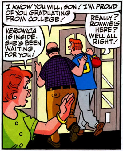
Look at Archie’s Mom there. What the hell is with her face?
Now, understand that many Archie artists have used the trick of running lines along the side of the face to connect jawline to cheekbone. DeCarlo did it all the time. Heck, Goldberg’s use of it back in his prime was excellent. It’s a perfectly valid stylistic choice.
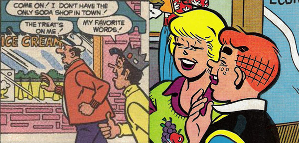
But compare DeCarlo and Goldberg’s work above with some of Goldberg’s work in Archie #600. Seriously: look at this shit.
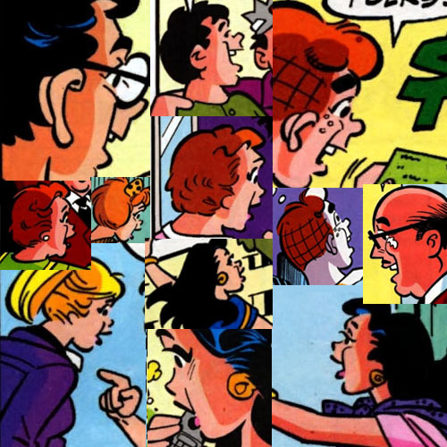
The net result is the idea that everybody in Riverdale has massive, massive jowls. Alternately, everybody in Riverdale is descended from the Tin Man in The Wizard of Oz. I can’t be the only one who thinks this looks ridiculous. Some of those jowl-lines are so pronounced that they’re practically spikes. Still, if this was the only problem with Goldberg’s work nowadays, I expect there wouldn’t be any issue. Much like how John Byrne has two faces he uses over and over again (one male, one female), it could be written off as artistic quirk rather than gratuitous error.
But.
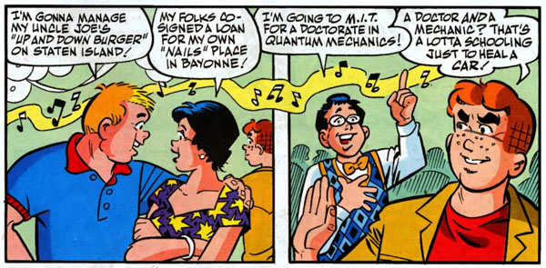
Midge – pointy jowls. Moose – jowls, and also he looks really fat when he doesn’t look that way in any other panel. Archie, meanwhile, appears to be preparing for a guest appearance on The Sopranos – Riverdale.
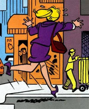
Betty was so distraught by the news of Archie and Veronica’s nuptials that her foot fell off!
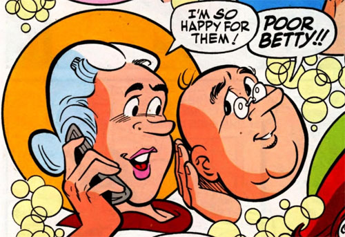
I note that apparently now Miss Grundy wears makeup all the time. Lipstick? Really? On Grundy? That is freaking me out.
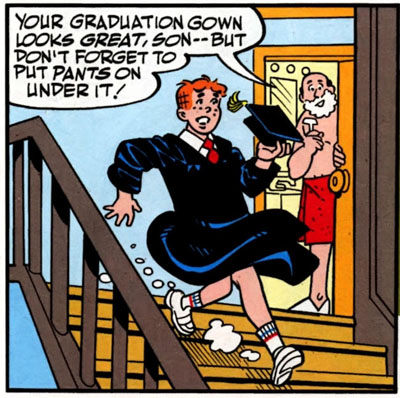
What is with Archie’s foot there? Is Rob Liefeld ghosting for Goldberg now? (No, no: if Liefeld were ghosting for somebody, everything would look suspiciously like an old Dan DeCarlo comic, badly traced.)
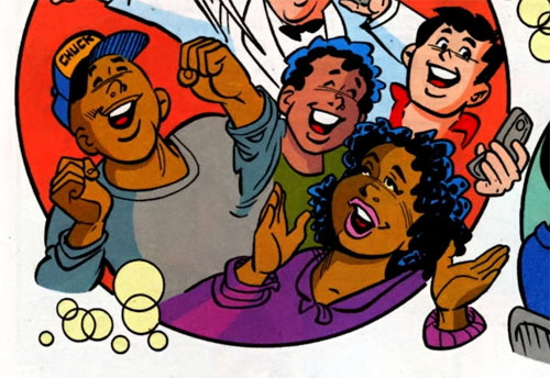
There is so much wrong with Cheering Black Girl’s face I’m not sure where to begin, but I just keep looking at it and thinking that her head looks like a potato.
(Also, Goldberg has helpfully given Chuck a baseball cap with his name on it, so we do not mistake Chuck for the plethora of other young black male characters in Archie comics.)
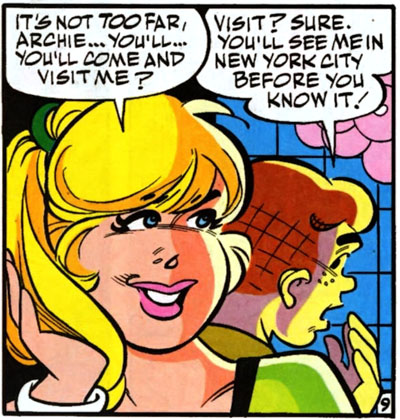
AGH KILL IT WITH FIRE
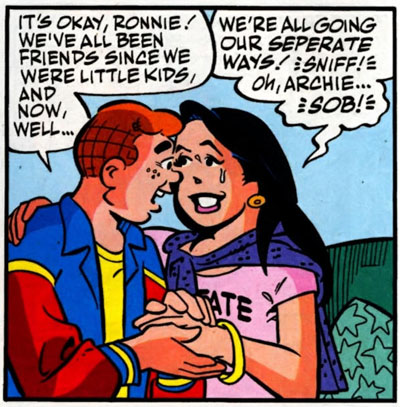
What the HELL? Look at Veronica’s face. It is deformed. It looks like she is so happy to be with Hinge-Jaw Archie there that her skull has started expanding. Oh well, maybe when we switch to the closeup –
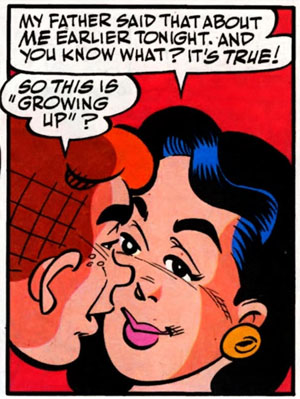
…no, apparently in closeup Veronica not only has a radically deformed skull but also her entire face is off-center to the left. (Understand that this is one of the big romantic beats of the comic, too; Goldberg’s art is actively working against the story at this point by being so odd.)
I could go on at length – there is plenty of bad art in Archie #600. But that’s not surprising because Goldberg hasn’t been up to his previously established level of quality for years now; it’s so bad that it genuinely looks like a different artist. Look at this panel from a 1979 Laugh:
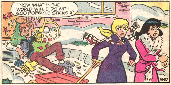
Naturalistic but vibrant: even an Archie stuck in a mound of trash conveys the just-previous motion of Betty and Veronica throwing shit at him and knocking him over, and Betty and Veronica’s stride looks realistic – the abstract nature of the cartooning conveys their movement skillfully. Now look at this:
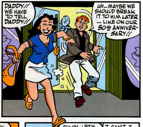
See what I mean?

Related Articles
23 users responded in this post
In the “A doctor and a mechanic?” picture, Archie doesn’t just look like he’s from the Sopranos, he looks like a Dick Tracy villain. He sort of looks like someone chopped his head in half horizontally, then slid the top half a half inch to the left.
And man, that closeup of the faces of Archie and Veronica looks like some kind of science fiction accident involving a teleportation device. Or maybe the Toxic Avenger is experiencing asexual reproduction.
Wow, you wouldn’t know it was the same artist at all. And I agree that the new art is pretty universally terrible — to me it looks like he’s trying to draw scenes that are more complex than he’s comfortable with, honestly.
As for the jowls thing, in the collage image, nearly every example is a drawing of a 3/4 from the back view, and it’s traditional to see the cheekbone like that, from that angle. I mean, he’s done a crappy job of it, but it is more or less correct.
Of course what Archie’s dad does not realize is that it is not a graduation gown. Archie is just on his way to a special bar he knows about.
Isn’t it obvious?
All the physical facial deformities and missing feet and whatnot are easy to explain.
Betty Cooper enacts vigilante justice on anyone who she has perceived as coming in between her and Archie. But she makes it look like an accident.
The insane jowls of doom just come from years of drinking soda at the Chok’lit Shoppe. Besides the years and memories there, those floats have enough sugar to induce diabetic shock in the uninitiated. Also Betty Cooper probably tries to spike the drinks there so that people develop an addiction (beyond the sugar one that is) because the place is a holy tribute church to Archie (when she’s not at home).
Is he doing the inks himself?
Is this one of those cases were an artist who really doesn’t do any steady art any more is brought back to do a special issue or has Goldberg been drawing Archie steadily since whenever he started?
Because if he hasn’t done it in a while it may partially explain why everything looks off kilter. If that’s not the case then I would have to assume he was either lazy or rushed when he did it.
Also, did anybody notice that the letterer misspelled separate as “seperate?”
I Called It!
Step 1 of Archie’s master plan is in action. He’s mutating the populace, starting with the women. With no where else in the world for these poor people to go, they will only be able find work and residence in Riverdale and now Archie is connecting himself legally to the captain of Riverdale’s industry my marrying his daughter.
No longer is Archie content to play with the lives of his classmates. Now he’s setting his sights on controlling the entire town. He’s set himself up as Riverdale’s own Dagon.
That lame-ass ‘heal a car’ line has stricken me with a vision: I now want to see Stephen King’s “Christine” done as a graphic novel, starring Dilton.
“One of Christine’s headlights had been shattered. Another flickered unsteadily off and on, bleared with a thin wash of Moose’s blood. The grille had been bent inward, and the dents in it approximated the shape and size of Moose’s torso with all the gruesome perfection of a deathmask.”
We could even keep the current artist, since all the characters already look like they’ve been run over by a ’57 Plymouth Fury.
In the “KILL IT WITH FIRE” panel, Betty reminded me of Miss Piggy. Then I realized that, in their dealings with reluctant love interests, they are both BATSHIT INSANE.
Coincidence? I think not.
Holy crap, Betty looks just like John Travolta in the kill it with fire panel!
Methinks you’ve stumbled across the solution to the Archie marries Veronica plot — that’s not really Archie but Mel Jay (aka Montana Bob aka Freckles aka Red Fever) from the epic ARCHIE MEETS THE PUNISHER comic! Mel Jay was one of the few gangsters to ever escape the Punisher’s lethal vengence (he was last seen floating away dangling from a giant Macy’s Thanksgiving balloon of the Shield.
It’s all making sense now…but then that means Ronnie’s been sharing a honeymoon with…ugh…
Damn. That’s just sad on a whole number of different levels.
Lister Sage: He’s never really stopped. He just started to draw worse some years back, probably because he’s been drawing these same characters since like, 1963, and is overdue for retirement.
I remember having this same reaction when I flipped through it at my local shop. “Oh right, Archie proposes, let’s see how this–Oh my God, what the hell is wrong with Veronica’s face?”
Some folks around the internet call that side expression that you highlight a “porn face”. Because really, the expression is screaming “phallic object goes where?”
Does anyone remember that Twilight Zone episode “Eye of the Beholder”, where the one they all consider freakish is a normal woman and everyone else is a deformed, pig-snouted monster?
Judging by the art, Stan Goldberg now lives in that episode.
I just want/need to add: Ronnie looks like Shannen Doherty. That is all.
[…] Now, that’s a good cover. It shows that Goldberg wasn’t always the guy turning out disfigured tinmen. You can see, with Reggie, how the curved mouth-to-jaw line, which has now gotten out of hand, was […]
I know exactly what you mean, Tux.
[…] is turning out now, though I much prefer Lucey’s take on the characters, and you notice that his use of very prominent face lines is already getting out of hand: on page 6, panel 3, it makes Veronica look weird. But the art is […]
[…] They still haven’t solved the jowl-line problem aaaAAAAAAAAAAA. Sabrina, Josie and the Pussycats, Humorama mens line, Jetta etc. etc. [↩] […]
Holy crap I never knew it was him all along I always thought it was a new guy! And it looks like really slipshod stuff you’d hand to your boss after completing it 10 minutes before the deadline.