Click on thumb to see full
As always, you can also go to the dedicated Al’Rashad site.
7
Apr

As always, you can also go to the dedicated Al’Rashad site.
31
Mar
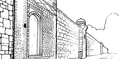
As always, you can also go to the dedicated Al’Rashad site.
18
Mar
…because apparently people think “greywashing” somehow sounds unethical. I don’t even know, folks.
Anyway, some more samples of what shadework would look like, and I wanted a cross-section of pages here so:
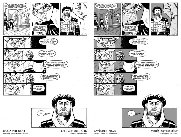
This is another night-time page, but I’ve lessened the shadows (we have here a 20 percent grey and a 40%) because it’s indoors in a lit room. This time the shadework’s purpose is to illuminate two things: Fezay’s expressions and Alric’s hands, both of which weren’t quite as prominent on the page as they could be in a straight black-and-white. (I also note that shading potentially lets Davinder go back and add details that otherwise would have detracted from his linework in the foreground.)
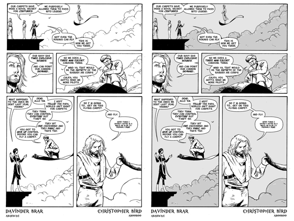
This is a good example of shadework for a daytime page: here it’s a 10% grey and a 20% grey for the clouds. These aren’t very dark greys but I think they’re just enough to make Vurmik really pop in panel three. Also note that using the grey on the clouds allows for some additional emphasis linework in white, creating additional texture on the crowds via negative space.
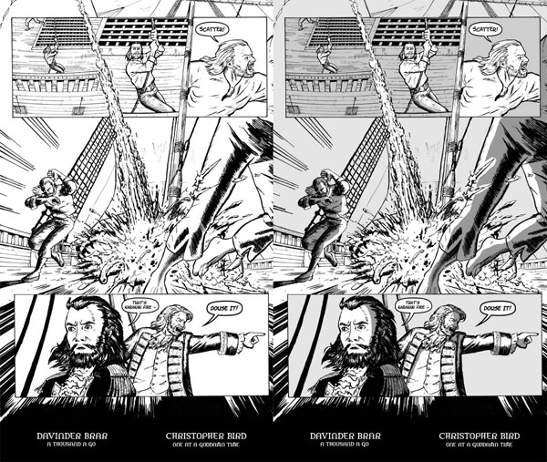
This is an example of a three-tone page: 10% grey for the basic background (both the sails and the sky – neither are terribly important to the panel so I want them to become background), 20% for the ship deck in the first three panels (to differentiate them from the surrounding sky on the page, and to push that Gundring sailor into the foreground and attract the eye to him as you start reading the page; the 20% grey isn’t necessary for the deck on the page’s feature panel because that panel is being lit up by the fire) and 45% grey for shadow effects created by the fire (which – yes, it’s daytime and realistically the shadows wouldn’t necessarily be that deep, but that dark grey really sells the fire).
17
Mar
As always, you can also go to the dedicated Al’Rashad site. And so concludes Book Seven! Only one more book to go! We might not be the fastest, but we’re reliable.
12
Mar
Well, sort of. This is just a canvassing-interest post.
One of the things we’ve been considering as a bonus for the collected edition of Al’Rashad – and the collected edition only – is the use of greywashing to make pages more dynamic. It’s not too complex but it can really make pages pop sometimes. As a comparison example, here is Book Four, Page Eighteen, both the original and a rough greywash applied:
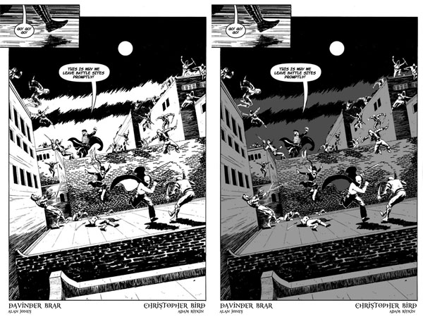
Greywashes like this can work as a semi-replacement for colouring in black-and-white comics (and truthfully, unless someone throws a truckload of money at us, colour is probably prohibitively expensive at this point given the number of pages that would have to be reworked). The effect can be quite useful on pages like this one to make individual figures “pop.”
So, comic readers: is this a value-add for you, or are you thinking “man, this is like Lucas and the Special Editions all over again?” Feedback appreciated.
UPDATE: So right now it appears that the majority of comments so far favour the greywash, but people who hate it really hate it. A few notes here:
1. Like I said: this was an extremely rough greywash, using two tones (a 60 percent grey and a 30 percent). I did it in about 45 minutes in Photoshop and I’m still not sure about the values – I really like that 60 percent to flesh out the night sky on this page, for example, but would want to test lighter greys for the buildings. If we end up using greywash in the collection, we’ll be putting a lot of thought into individual pages and consider using three tones or even one tone rather than two on a page by page basis (you have to be careful with three tones, though, since three distinct greys can muddy the page; the third tone has to be used very sparingly). More to the point, there will be plenty of pages (the tunnel sequences in Book Four, for example) where the greywash simply isn’t necessary or desirable.
2. There’s no question that greywashing changes the reading experience of the book; it simulates, to an extent, the effect that color has on the reading experience, and what color does to a reading experience is create greater emphasis on the individual elements of the scene. (It should be noted that Davinder’s inking style means that the other major method of creating greys in black-and-white art – stippling and linework – isn’t really available to us as an option.)
3. If we ultimately decide to go with the greywash, we’ll find a way to collect the original edition as well – most likely bundling a digital version of it along with the digital version of the greywash, maybe include a coupon for the digital with the physical collection, etc.
Anyway. Right now we’re leaning towards it, but I’ll do some tighter greywashing on a few more pages next week so we can get a second round of opinions.
11
Mar
10
Mar
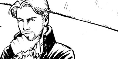
As always, you can also go to the dedicated Al’Rashad site.
3
Mar
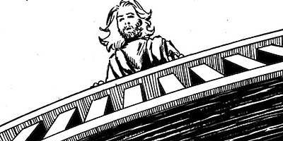
As always, you can also go to the dedicated Al’Rashad site.
24
Feb
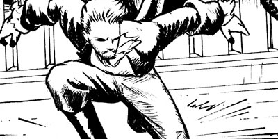
As always, you can also go to the dedicated Al’Rashad site.
18
Feb
I’ve been running an ad campaign for Al’Rashad for the past couple of weeks on Project: Wonderful and it has been an interesting experience to see what has proven to be a worthwhile investment. A lot of my initial predictions about which comics would prove the best advertising space have been correct; a lot have not been correct. Meandering thoughts follow:
1. Ad size and placement matter. This is probably so obvious that it does not need to be said, but: leaderboard ads at the bottom of a page are less effective than leaderboard ads at the top of a page. Skyscraper sideboard ads get less effective the further down the page they are. Half-banner ads with less visual real estate are less effective than leaderboard ads that are twice the size. And so forth. This was most dramatic on Girls With Slingshots, where I had a half-banner ad running and which received over two million page-views of the ad itself, but a clickthrough rate that was abysmal. On top of which, while my banner and halfbanner ads were, I think, quite elegantly designed, the leaderboard and skyscraper ads were just better: more art illustrating the fantasy world concept more dramatically, the opportunity to use a cool slogan (“Welcome To The Next Grand Adventure” – I went full Stan Lee on it), etc.1
2. Site selection is harder than it looks. I had a shortlist of sites I wanted to consider advertising on, either because I admired their work or because I thought they’d have a reader base more inclined to click through or both. Many of these ideas did not work on the metric I was using, which is “cost per clickthrough.”2 Girls Without Slingshots, for example, was a relative failure, even if I do love Danielle Corsetto’s work and felt her audience might be receptive to an LGBT/minority-friendly fantasy adventure (the ad campaign started the week of the Alric reveal). Axe Cop was an outright failure: expensive, very few clicks. Hark! a Vagrant and Dinosaur Comics (both of which I wanted to advertise on because, hey, fellow Canadians) were both mediocre advertising opportunities. The Jinxworld forums underperformed sharply and I kept those ads up for “visibility” longer than I should have done. The Giant in the Playground forums were, on the other hand, solid performers throughout, and my MVP turned out to be Gunnerkrigg Court, which sent me engaged comic readers at excellent price points.
3. Avoid overpriced traffic. Early on I decided that I wanted to concentrate on getting clickthroughs as efficiently as possible, and gave myself a certain level of expense per clickthrough in order to make that happen: I wanted the largest number of potential readers as opposed to the more nebulous “let’s raise our public profile” objective some people want out of an advertising campaign. The problem with this is that a lot of PW traffic is so overpriced that getting efficient clickthroughs becomes nearly impossible. H!AV and Dinosaur Comics are both good examples of this: the problem was not that they didn’t send me a reasonable number of clicks as compared to total unique readers visiting their sites, but that because they are Stars of the Webcomic World, the price for those clicks was too expensive; I mean, if I get an engaged reader for my comic, I don’t care if they came from Dinosaur Comics or a furry porn website.3 And those two comics weren’t nearly as bad as Questionable Content (insanely expensive, never justified the cost) or Saturday Morning Breakfast Cereal (high-priced, reader base didn’t really transfer) or, and this surprised me a lot, Oglaf. I thought Oglaf readers would be a lock to enjoy Al’Rashad but, although they sent a reasonable number of readers my way, not nearly in the numbers I expected given their readership nor did those readers come at an affordable price point.
All of this said: the advertising campaign was quite a success and readership of the comic has clearly spiked in a sustainable way, because – and I say this with a bit of ego at least – there’s a lot of good comic for people to read, and that’s the most important thing.
17
Feb
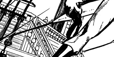
As always, you can also go to the dedicated Al’Rashad site.
10
Feb
As always, you can also go to the dedicated Al’Rashad site.
8
Feb
OK, so this is possibly premature. It’s only the first issue, after all; this isn’t even like watching the pilot episode so much as watching the first ten minutes of the pilot episode. But the first issue of the new Ms. Marvel is definitely something to love. And not just because it’s a genuinely different perspective on the superhero story, created by people who have a genuinely different and interesting take on the “teenage hero” subgenre; this is a great comic because it’s awesome.
Pretty much every page has a laugh-out-loud line, from Kamala’s unseemly interest in bacon on page one (“delicious, delicious infidel meat”) through to her Avengers/My Little Pony fanfic (which has almost 1000 upvotes on freakingcool.com) to her explanation that she wants to be just like Carol Danvers, “except I would wear the classic, politically incorrect costume and kick butt in giant wedge heels.” G. Willow Wilson makes Kamala instantly charming, funny, relatable and sympathetic, while giving the reader a look at a cultural experience that doesn’t share a whole lot with Peter Parker or Richard Ryder or Christopher Powell or…wow, there’ve been a lot of whitebread teen heroes out there over the years.
But again, I don’t want to say that this is a “worthy” book, even though it is, because what strikes you about it isn’t that it’s saying something important about race and religion and cultural relations and the very real prejudice that second-generation immigrants from Muslim countries face, and the difficulties they have in fitting in with their native culture while keeping true to the cultural heritage of their families. I want to say that this is a good book, because it’s well-written and amazingly drawn by Adrian Alphona and Ian Herring and it really made me want to see what happens in the next issue. And ultimately, that’s what you should want out of your comics on a monthly basis. That’s what I love about comics. And I’m happy I took a flyer on this one.
3
Feb
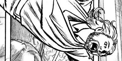
As always, you can also go to the dedicated Al’Rashad site.
"[O]ne of the funniest bloggers on the planet... I only wish he updated more."
-- Popcrunch.com
"By MightyGodKing, we mean sexiest blog in western civilization."
-- Jenn
